We have a lot of data here at Mainbloq and we believe that the more data we can supply to our customers the better decisions they can make when they trade. Today we’re thrilled the release some of that data to EVERYONE with Mainbloq Charts.
Our charts showcase some of the data we have as actionable information. Mainbloq is an all-in-one platform for digital assets providing a suite of tools to consolidate real-time data across multiple venues, and to translate data into information and algorithms for best execution of user-defined trading strategies.
Read below to see descriptions of the charts we have available for your use. To see our charts go to https://mainbloq.io/charts/
Order Book Live View

With this chart you can see where market depth is currently quoted. The venues are color coded and displayed in pie charts for bids and asks, as well as a depth chart. All prices are normalized to the “stable price”, which accounts for the exchange rate of the stable coins.
How to use it:
- Enter Currency Pair and press go
- Use mouse to zoom in Combined Depth (you can reset zoom)
Historic Volatility Explorer

With this chart you can explore the historic volatility of an asset. Volatility is an important measure to inform trading decisions indicating the potential price variability over time.
See the trends in historic volatility alongside price movements. Recalculate the Historic Volatility with differently sized dolling windows to smooth or enhance details.
How to use it:
- Adjust Slider to re-scale rolling window of calculating volatility
- Switch between Log and Linear Scales
- Pan with Date Range selector at bottom to Zoom to area of interest
Volatility Distribution

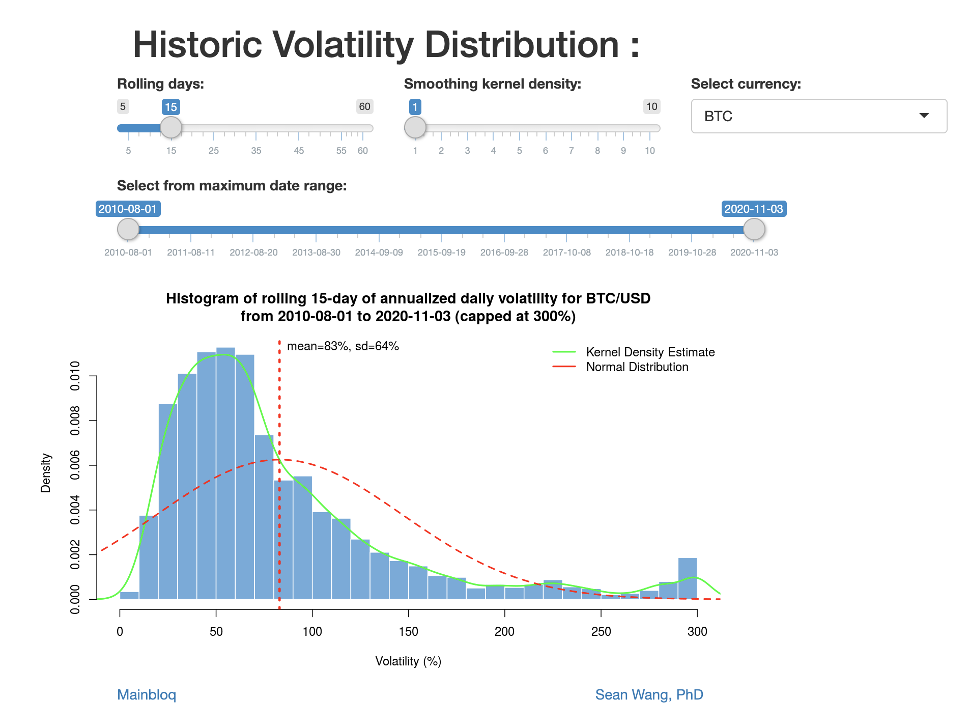
With this chart you can explore how volatility is distributed. We take the daily historical volatility distribution, compared with Kernel density and the normal distribution.
How to use it:
Slide the time window to see how volatility has been decreasing over the years, in crypto.
Volatility by hour

With this chart you can explore the volatility of an asset by hour in the day.
Time is based on UTC (London) and it looks at last 10 weeks of data (more data is available with subscription)
How to use it:
Red line = mean
Box top/bottom = 1 standard deviation
Tails = 2 standard deviations
Dots = outliers (capped at 300%)

